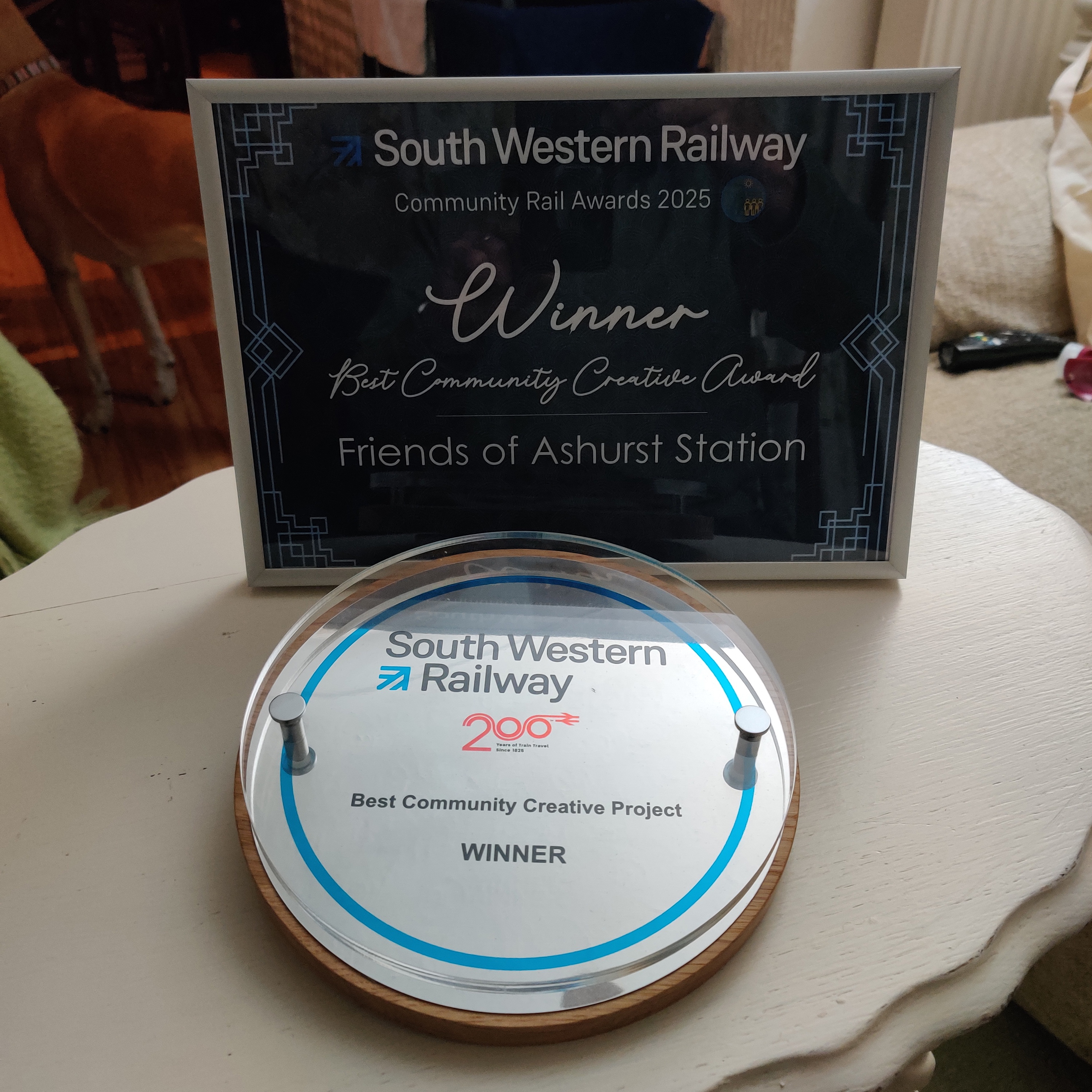
The new Longdown Activity Farm leaflet has been printed and distributed ready to be discovered by families in and around Hampshire and the New Forest.
I've been designing and illustrating the leaflet for several years now, so we decided to give the cover layout a tweak to build on what had gone before. This meant some new cartoons and a slightly different approach to the photography, and the end result is rather pleasing.
Despite being a ten-page fold-out leaflet, there never seems to be enough room to fit all of the information in as the farm offers so much to see and do throughout the year, and it's always changing, so it's a challenge to keep everything readable and accessible. The end result is always pleasing, and whenever I visit the farm I always get a kick out of seeing families using the hand-drawn map I created to find their way around.
If you've never visited Longdown Activity Farm before then take the opportunity this year - great fun.
Thanks to Gina Rayner at GR Care Consultancy I've had the privilege to work with many care homes, nursing homes, learning disability homes and domiciliary care services on various requirements from care plans to signage. One of those jobs was for the beautifully restored Blackbrook House in Fareham, a Grade II listed Georgian property in landscaped gardens. It's a genuinely stunning place, gorgeously decorated with a magnificent eye for detail that also reflects the level of care the home offers. As a new home, they wanted a brochure that reflected the beauty of the building and the standard of the care.
Half the battle with any brochure such as this is the imagery, as often people will glance through the pictures before they decide to read anything. Fortunately Gina had also suggested the photographic talents of Focal Strategy who went along on two occasions to photograph the 26 distinctly individual bedrooms, the reception rooms and gardens, leaving me with a fantastic range of photographs to choose from.
The brochure is designed to reflect the interior of the home (furnished with the likes of Laura Ashley and Sanderson) with the text set in a larger than normal type-face to help its readability with those whose sight may not be as it once was.
The home is an amazing place, and as it says on the front of the brochure, a beautiful place to live.

I've just completed the latest edition of Networks magazine for Hampshire FA. It's aimed at communicating everything clubs, players and officials need to know about the grassroots game. This issue includes news on the 2011/2012 County Plan, the FA Community Awards and changes in refereeing, and at over 40 pages it's a substational read.
If you think I could help with your newsletter or magazine then do get in touch.

The great thing about roller banners is that they're easy to transport, easy to put up and easy to take down, making them the ideal way to add some visual impact to presentations, stalls and exhibitions. You can use them as instant colourful backdrops or detailed instant information boards, and it's their very vesatility that has made them so popular.
I don't always get to see the finished designs if they're being delivered direct to the client, so Hampshire FA have been good enough to send me a photo of the recent set I designed for them and made by those wonderful folk at Splash Display.
If a roller banner or two (or four for that matter) could help you promote your business, group or event, then do get in touch.

Look out for the latest issue of the Waterside Network Group's Focus magazine, dropping through letterboxes along the Waterside in the coming days. Designed and laid out by Ceratopia, this is a magazine to promote and support local businesses, and this month the cover star is... me.
Because of my new children's book I thought it a good opportunity to grab the cover when it became available at the last moment; a perfect opportunity to spread the news locally as the magazine has a 15,000 distribution down the eastern edge of the New Forest.
You can read more about the magazine, and the Waterside Network Group, at the Waterside Network Group website.
When you've a lot of information to impart paragraphs of text can become too much of a trawl for the reader. One way around this is to show the information graphically, such as with this data map produced for Hampshire FA.
Every year Hampshire FA chart the number of active participants involved with structured, regular football. The data is divided up between adult 11 v 11 and female 11 v 11 football, youth male and female 11 v 11, mini soccer and FA charter standard clubs, requiring a map for each. Then each map charts how each district within the county compares to the national average and what change there's been since last year. With the traffic light colours and simple labelling the data is obvious at a glance.
The maps have been adapted to cover other requirements, such as the whereabouts of clubs and investment in facilities. Neighbouring county FAs have also been commissioning them, and have included the availablity of referees and the reach of local leagues.
In most cases the artwork is supplied as PDFs to be shared as needed with colleagues, but occasionally the maps are created to illustrate the availability of upcoming training courses for the public. In those cases, interactivity can be built into the PDF so a click on the map takes you to an online booking form on Hampshire Fa's website.
And all so much nicer to look at than paragraphs of text and tables.

Your logo represents your business and is an important part of that first impression you give to a potential customer. I'm sure you've read stories about logos costing a staggering amount of money to develop that never justify the expense. Because a logo can be a personal thing if you're a small business or a group decision if you're a large one, inevitably it can be a drawn out process. But the time spent - and so the costs incurred - can be greatly minimised by taking the initial time to understand what it it is the client is after and so narrow the focus for the creative process.
I've recently completed a new logo for DataClear, a Southampton-based company that helps businesses become more effective through information technology.
DataClear already had a strong idea of what they wanted, especially with colours, but were open to anything from minor tweaking to a full reworking of something they'd created themselves.
Because they were so clear in what they liked the first step was to produce variants and subtle reworkings of their starting point. This helps keep the costs of the development down rather than me take time creating fresh ideas from scratch. Dataclear were quickly able to identify a version that was working and the entire process was completed with the minimum of fuss and cost, including the design of business cards.

Throughout December I was busy creating a number of cartoon characters for a company that develops products to raise awareness of children with allergies (more about this later in the month).
Now that the character side is finished the client asked me to help design the packaging. This has involved a series of stickers, and 14 different branded box designs for each of the allergy-specific products. Not only did this include the designing and laying out of the box, but also the creation of the various different types of barcodes and the assembly illustrations.
If that's something you think I may be able to help you with, regardless of whether it's got cartoons on or not, then do get in touch.
The latest edition of Hampshire FA's Networks magazine has hit my door mat, so if you're involved with grassroots football throughout Hampshire you should have got yours too.
I design and lay out the magazine for Hampshire FA three times a year, and this issue is a healthy 44 pages including the FA pullout in the centre.
Hampshire FA supply the stories and most of the imagery and I present them by laying them out in this mag format. If we're short of imagery I try to source something suitable from affordable image libraries. The magazine has grown from what was once a simple newsletter, so over the years we've devised a good working relationship that can accommodate the magazine's size and number of stories with the minimum of fuss.
If you're looking to spruce up a magazine, pep up a periodical or enliven a newsletter into something friendlier and more accessible, then do get in touch. We'll be happy to help.
The lead character from my New Forest Friends children's books is called Beaulieu the Hedgehog and, when the first book was released, children from Beaulieu Infants School attended the launch by being driven in a Rolls Royce Silver Ghost kindly supplied by the National Motor Museum, also at Beaulieu. So when I was asked earlier in the year by Jane Noble, the headteacher of Beaulieu Infants School, to submit designs for the new school logo I was happy to oblige.
Fortunately for me the staff and governors opted for my design and it has now been adopted by the school.
John Hawkins, the Chair of Governors, said: "I would like to thank you very much for all the work that you put in on the new school logo, it was much appreciated. The result was excellent and it looks great on the new sign outside the school."
It was a pleasure to give something back to a school who so kindly donated time and effort to support me and my first book all those years ago.
« Back to all posts